Patterns of school
performance and expenditures among elementary and middle schools in 90 of
Texas’ largest school districts
The pair of interactive
graphs that are presented by selecting Item 2 on the left display data representing
3,453 elementary and middle schools which are members of 90 of Texas’ largest
school districts. The data, relating to the 2017-2018 school year, are used to
address the following questions:
1.
How do the patterns of STAAR test
score performance versus percent of economically disadvantaged students vary
among elementary and middle schools in these 90 large districts?
2.
How do expenditures per pupil vary
between higher-poverty and lower-poverty schools within these 90 districts?
3.
How much does per pupil spending for
schools with at least 70 percent economically disadvantaged students vary
across the 90 large districts?
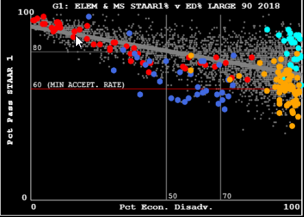
The following figure gives an
indication of the types of different performance patterns exhibited by the
elementary and middle schools in 4 different districts. The light gray dots
each represents a school in the other 86 districts.
These questions are explored
in the two papers which are linked to on the left, namely Item 8: and Item 9:
The brief instructions
contained in Items 3 through 6 should enable viewers to begin interacting with
the graphs and data to explore these or other questions on their own.
Note that the two buttons
beneath the data area—LHG and RHG—permit putting different graph layouts into
each picture area. These and other options are described more fully in the
Instructions and Examples that are linked to beneath the data table in the
graphics page.
Questions and feedback are
welcomed. I can be reached at ltoenjes@aol.com .
Larry Toenjes
Clear Lake Shores, TX