Information re. ScatterBrain™
ScatterBrain is designed to facilitate
the exploration, analysis, and presentation of data sets in a hands-on,
interactive fashion. In its simplest use, the points in a single x-y type
scatterplot can be identified, and their underlying associated data displayed
in a user-specified format in a data window. Data for multiple points can be
presented, row by row, in the data window for ease of making comparisons.
Individual points can be identified either with the aid of a mouse cursor, or
by typing in a name associated with each row of data. In addition,
multiple points can be selected and counts, totals, simple averages, and
user-specified weighted averages calculated and presented in the data table.
As individual data points are identified
their names can be deposited on the screen at locations determined by the mouse
location. This in itself is a very useful feature when identifying points
that are in close proximity to one another.
In addition, still focusing on a presentation
that displays only a single graph, regression lines (also sometimes called
average slope or trend lines) can be superimposed upon the plotted points and
lines representing one or two standard errors of the estimate above and below
the regression line may be displayed as well. Second degree polynomials can
also be fitted to the data and displayed in the graphs.
One of the most unique features of
ScatterBrain is that all of the options described above can be used on
multiple, interrelated scatterplots. Up to four such graphs can be shown
simultaneously. When a point is identified and begins to blink on and off
in one graph, it will blink in the same color in all graphs. In addition,
the specified data written to the data window for the corresponding row of data
is color coded for ease of making a visual connection between the data shown
and the location of the corresponding point in each graph. When multiple
points are identified at once in one graph, all of the corresponding points are
simultaneously highlighted in the same color in all of the other graphs then
being shown.
Following is an example created
using US Census data.
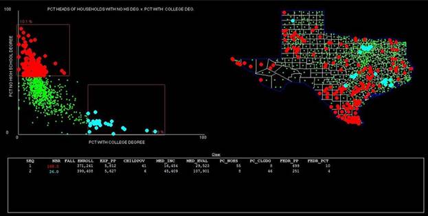
This view was created
with ScatterBrain in the mode that uses multiple points. A feature
permitted enclosing approximately 10-11 percent of all students in each of the
two sets of districts selected. The scatter plot presents districts based upon
the percentages of heads of households who did not have high school diplomas
(y-axis) versus the percentages of heads of households having college degrees
(x-axis). The two rows of data show that although both sets of districts spent
approximately the same amount per pupil, those with less-educated parents had
nearly 7 times the poverty rate among children, one-third the household income,
and lived in homes less than a third of the value of those housing families in
the more educated group. There is a distinct geographical pattern to these
points, which is quite visible.
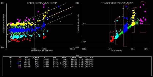
Another education-related data set used to demonstrate ScatterBrain's methods
to display and query data includes school finance data for Texas school
districts for school year 2004-2005. School district spending and
property wealth data are often normalized by dividing each by the number of
weighted students in the district. The weighted student counts include
many of the factors that direct additional state dollars to districts for such
criteria as numbers of students eligible for free or reduced price meals,
numbers of special education students, numbers needing special instruction in
the English language, and others. Theoretically, if all of these factors
are accounted for, total state and local dollars per weighted pupil
should be virtually the same for all districts within a certain range of wealth
and tax rates, but different for districts with different tax rates. The
following graphic was produced with this data set. It shows that for a
large proportion of Texas school districts, including some 85 percent of all
students, the "equal reward for equal tax effort" rule indeed
prevails. For those districts whose tax rates or property wealth per
pupil exceed the upper bounds, much greater levels of total revenue per
weighted pupil are observed.
The exhibit was created by drawing rectangles around slices
of tax rates in the right-hand graph, which resulted in corresponding points,
representing school districts, being highlighted in the same color in both
graphs. Summary data for each group is
also displayed beneath the graphs. From the two graphs, and the data for tax
rates (MTR and TTR) and total revenue per weighted students (TR_WADA), the
positive relationship between tax rates and revenues can be observed.
A more recent example is based on the data for the
elementary and middle schools in Texas’ 90 largest school districts. This is the data that was used in a soon to
be published paper (March, 2021) that focuses on school operations expenditures
broken down between high-poverty and low-poverty schools in each district. The paper, “Does Texas’ Compensatory Education
Funding Get to the Intended Students?” will be published online in Education
Policy Analysis Archives (www.EPAA.org ). A preliminary version can be downloaded here.
The following exhibit contains two graphs, one showing performance on the
state’s standardized test (STAAR1) and the other showing operations
expenditures per pupil, by school, with the percentages of students eligible
for the free and reduced-price (ED) lunch program on the horizontal axes. The
schools in two districts are highlighted, those in North East ISD in red, and
those in Galena Park ISD in aqua.
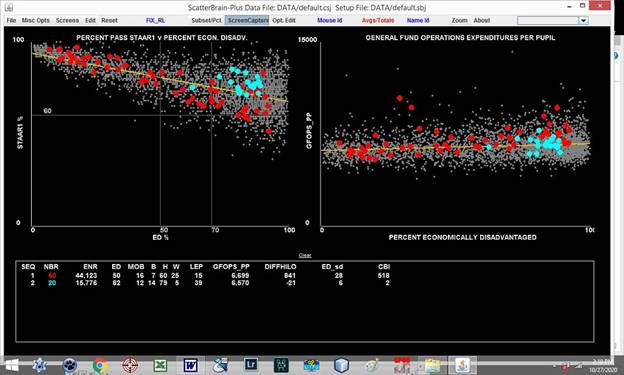
The two districts are quite different, with the schools in
Galena Park ISD concentrated at the high poverty end. For comparable levels of ED the schools in
Galena Park ISD appear to be performing better on the STAAR1 test. But in terms of expenditures per pupil, the
high poverty schools in North East ISD appear to have higher spending
levels. The number for North East ISD
beneath the heading DIFFHILO indicates that that district’s higher poverty
schools have expenditures of $841 per pupil more than their lower poverty
schools. This is a fairly regular
pattern, found in many districts whose schools have a large range in terms of
poverty rates. They find ways to, in
effect, redistribute resources from lower poverty schools to higher poverty
schools. This is further explored in the
next exhibit.
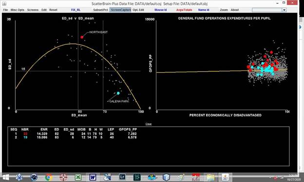
In the above diagram the schools in North East ISD and
Galena Park ISD which have more than 70 percent economically disadvantaged
students are highlighted and their summary data written in the data table. As can be observed, when restricted to the
high poverty schools in both districts, expenditures per pupil are $7,282 in
North East ISD, which is $704 per pupil greater than the $6,578 in Galena Park
ISD.
The graph on the left indicates that the mean ED in North
East ISD is much less than in Galena Park ISD, and that the standard deviation
of the EDs among its schools is much greater.
Consequently, North East ISD has much greater opportunity to shift
additional resources to its higher poverty schools. In the paper based on these data, these
observations are used to argue that the additional funding weight for ED
students should be greater in districts such as Galena Park ISD, where all of
its schools have high levels of ED and thus have little or no opportunity to
shift resources to it most poverty-stricken schools. As a result, as shown in
the comparison of these two districts, expenditures per pupil in the highest
poverty schools is greater for the schools in the districts with much lower
over-all rates of poverty.
Downloading and Trying ScatterBrain
ScatterBrain is written in Java. Consequently,
the executable file that is downloaded when you click on the link below
includes a Java run-time module.
The program is bundled with the data used in creating the last two exhibits
above. Ordinarily, to get from raw data to a presentable chart requires several
steps--choosing variables to be plotted, establishing scales, reference lines,
and so forth. The package to be downloaded contains setup files that
create several graphs, formats the associated data tables, and instantly puts
them on the screen. They are closely tied to exhibits that appear in the
preliminary paper referenced, and linked-to, above.
If you choose, you can modify the graphs and
options and save those changes in a new setup file, and save it on your own storage
device. Once created, either manually from scratch or by a previously
saved setup file, the graphs can be interactively queried.
The complete User Guide is also available for download below. It is in
Microsoft Word (c) format. The User Guide really must be read and studied if
you choose to try the program.
Click to download:
ScatterBrain User Guide
ScatterBrain with Texas Big90 data
Final Comments
The version of
ScatterBrain included in these download files is fully functional. The data
files used are simply tab-delimited text files with field names in the first
row, integer row ID numbers in the first column, alphanumeric names associated
with each row in the second column, and alphanumeric names, beginning with
letters A..Z, for any categorical variables. All other columns contain
numeric data.
My son, Laurence P Toenjes, made substantial contributions to this project.
If you would like to try ScatterBrain with your
own files send me an email. This offer is only for non-commercial use.
Larry Toenjes
711 West Shore Drive,
Clear Lake Shores, TX 77565
ltoenjes@aol.com